mimo
Connecting in the COVID-19 Pandemic
…
mimo (meet, interact, mingle, onwards) is a social mobile application that aims to improve the social experience of college students experiencing loneliness during the COVID-19 pandemic.
January 2021 - March 2021
10 Weeks
Annie Liu, Shreya Senthil,
Michelle Pearman, Zubaida Al
UX Designer
UX Research, UX Design,
Prototyping, Usability Testing
Figma
Date
Duration
Team
Role
Skills
Tools
Problem Statement
Making friends as a college student has been harder than ever due to the lack of physical interaction during the COVID-19 pandemic. This has negatively affected the well-being and mental health of college students, especially those who are moving to a new school and haven't had the opportunity to make friends yet. With everything online, it can be awkward and difficult to find opportunities for social interaction and initiate those first conversations that lead to friendships.
Vision Statement
We hope to help college students who are experiencing loneliness have a positive experience making friends online. By creating an experience that is tailored to the user, users have the opportunity to choose the type of connection that they wish to make in a safe online environment.
See the process.
01. Research
Interviews
Our team conducted 8 semi-structured interviews to understand the wants, needs, and frustrations of our target user. Our target users are college students who are experiencing loneliness as a result of the pandemic and are looking to make friends, both long term and short term, in a safe, online environment.
All interviewees were asked the following interview questions.
Interview Questions
Has the COVID-19 pandemic affected your ability to socialize?
Has the pandemic affected your ability to make new friends?
Have you experienced more loneliness during the pandemic?
Which social media platforms do you currently use?
When it comes to using a new social platform, what factors do you consider before using it?
Think about the last time you met someone online, can you describe what worked and what didn’t?
Would you personally be interested in a new social platform that would allow you to connect with people that go to the same university?
In addition to these questions, we asked follow-up questions we found appropriate to continue the conversation. To end the interview, we took a participatory design approach, where we ideated possible solutions with the interviewee. Our team explained the ideas we had to address loneliness, and interviewees replied with suggestions and what they would like to see in the solution.
Key Insights
1
2
3
4
Users have experienced more loneliness during the pandemic and want more socialization.
Before using a new social platform, users consider their privacy, the credibility of the developing company, how many of their friends are already on the platform, and if the platform is different from social platforms that they already use.
Users want to feel safe when engaging in socialization online with people they don’t know and want to have control over the types of interactions they have (e.g. if they’re looking for a friend, significant other, study buddy).
The biggest pain point users experience is the awkwardness at the beginning of a conversation with someone new.
Competitive Analysis
Following interviews, our team researched existing online platforms that people use to connect with each other (social platforms such as Instagram and Omegle). Analyzing these platforms helped us recognize what is already offered on the market, what works successfully, and what might be missing in terms of helping users build relationships online.
02. Personas
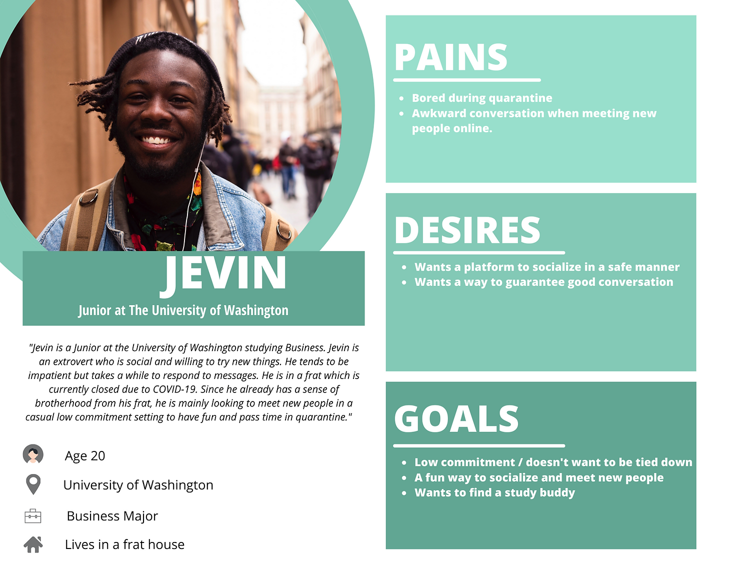
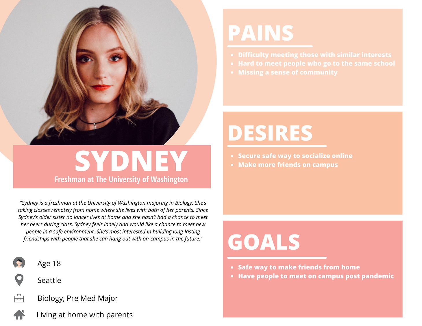
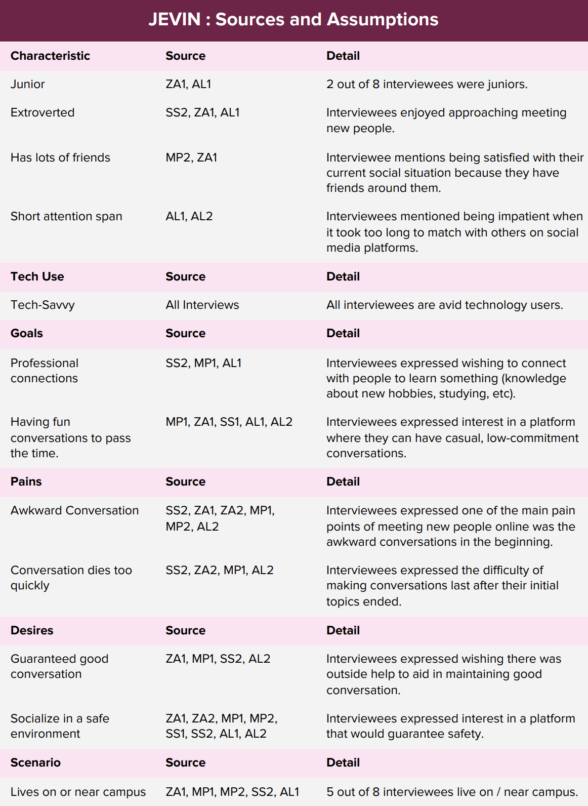
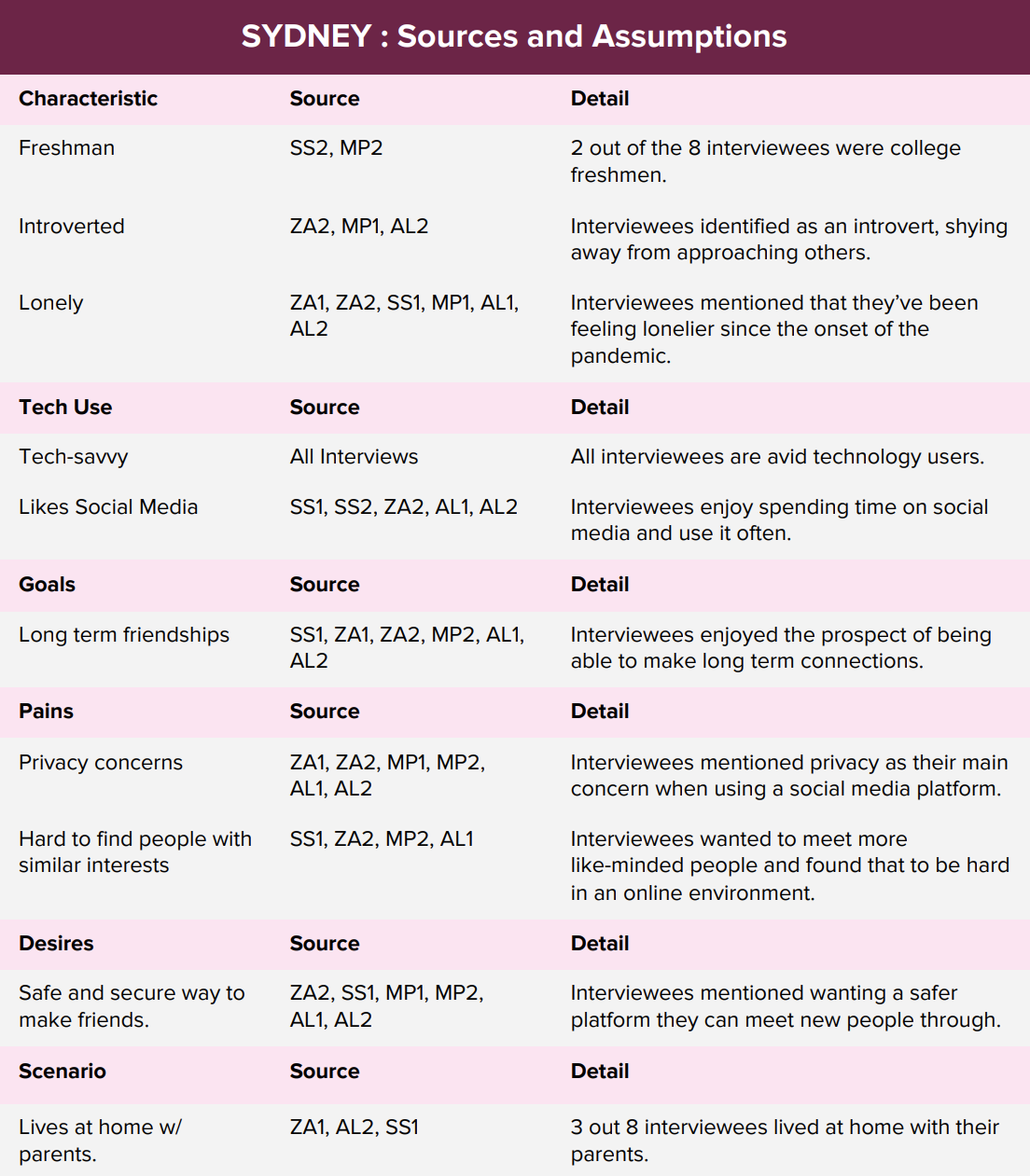
Meet Jevin and Sydney, two personas created to represent the typical user of our product. We used these personas to guide our design process while prototyping.
03. User Journey Map
Our team developed a user journey map that followed our typical user's day and compiled all of the possible highs and lows. Considering the user’s emotional trajectory at each event helped us determine where our solution could potentially come in.
User Journey Map (click to enlarge)

04. Design
Defining the Solution
Through our solution, our team wants to address the following design goals:
Address loneliness experienced by college students during the COVID-19 pandemic.
Give users the opportunity to engage in meaningful conversations in a safe online environment.
Give users the opportunity to choose the type of connections they want to make (friends, significant others, study buddies).
Design Requirements
To work towards the design goals, our team developed the following design requirements:
Users gain access to the application by signing in with University NET ID.
Users build a profile to gain more accurate matches.
The platform’s algorithm matches users based on their input, such as topics and filters.
The platform provides prompts to guide conversations.
Engages users in gameplay to break the ice in conversation.
Unlock details about the user as pairs progress through levels.
Provides anonymity to protect users’ privacy through the initial stages of chatting.
Once the design goals and requirements were set, our team ideated our solution.✨

Say hi to mimo! :)
As we learned more about our users during the research phase, our team began to think of mimo, a mobile application that aims to improve the social experience of college students by anonymously pairing users based on shared interests.
mimo stands for meet, interact, mingle, onwards.
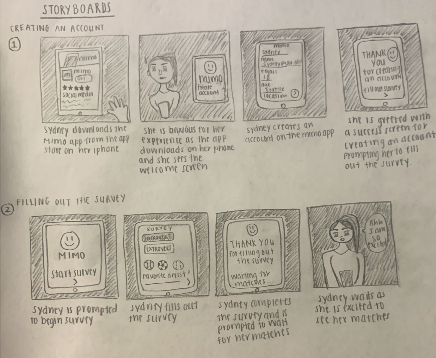
05. Storyboards
We created storyboards to gain a better understanding of how our users would be interacting with our product and explore the best ways to approach our design solutions. They helped us establish the different features of our product and determine that mimo would work best as a mobile application.
06. Information Arch.
We mapped out the possible interactions as well as the structure of our application through an information architecture map. With the map, we were able to locate points of confusion and redundancy in order to have a smoother user flow. It was also useful to see which paths are necessary and which paths may not serve the application’s purpose.
Information Architecture (click to enlarge)
07. Lo-Fi Prototype
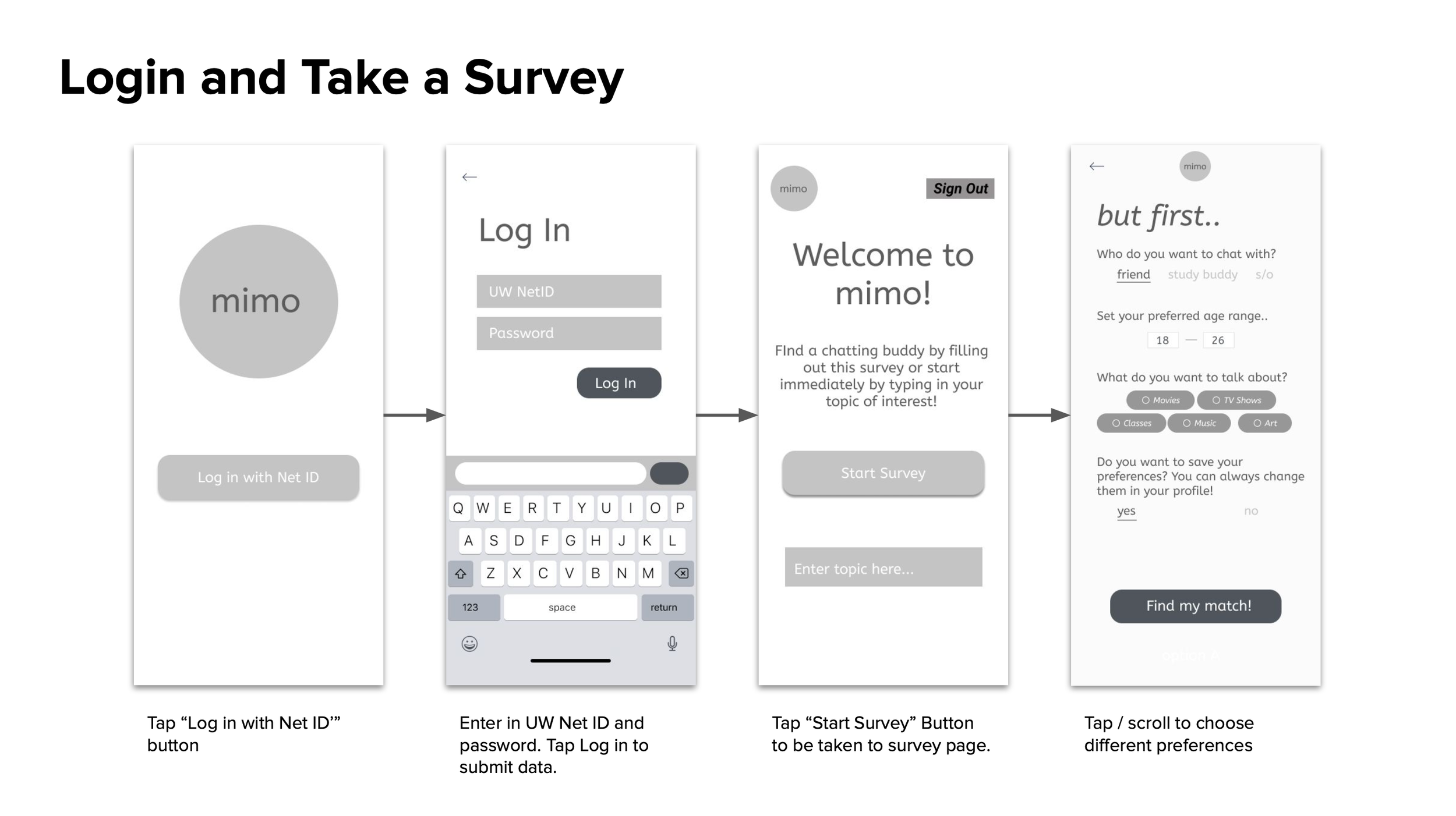
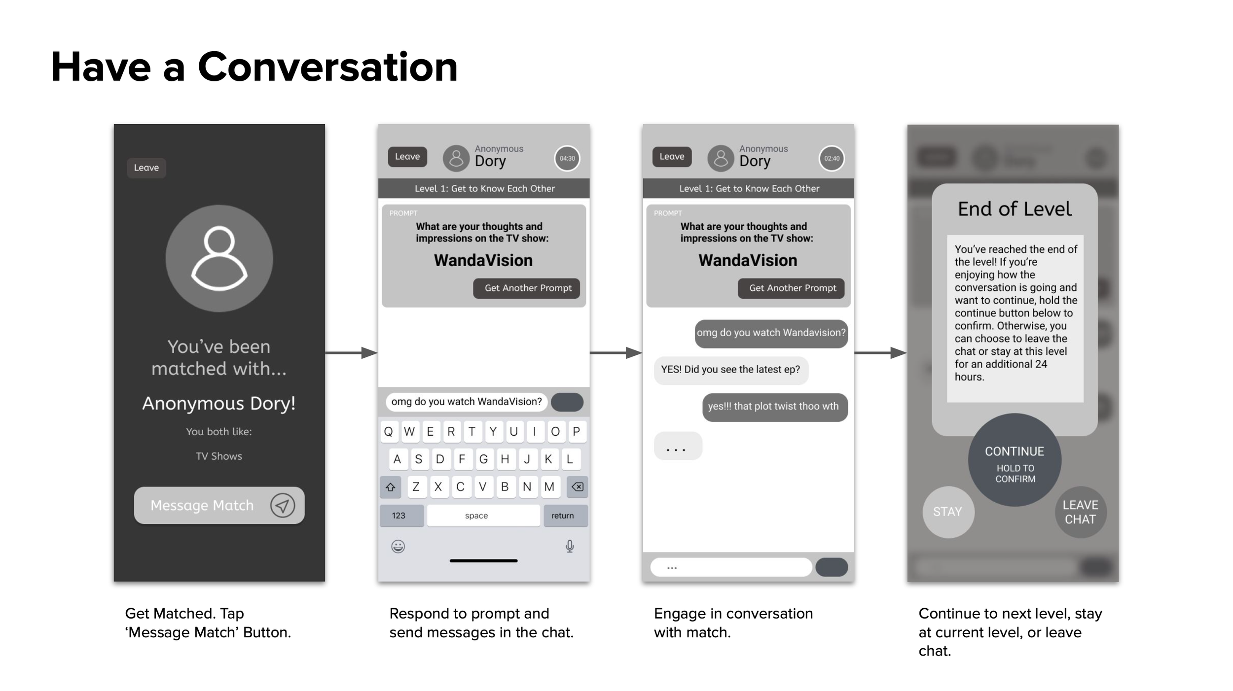
Since our team collaborated remotely, in place of paper prototyping, we developed a low fidelity interactive prototype using Figma. We worked towards developing three key user tasks: taking a survey, having a conversation, and finding a new match.
Feel free to interact with the lo-fi prototype!
Key User Tasks
1 | Take a Survey
2 | Have a Conversation
3 | Find a New Match
We also annotated our lo-fi screens! See the annotations here.
08. User Evaluations
Our team utilized the lo-fi prototype to conduct usability tests with four target users. The aim of the study was to evaluate the usability of the application and identify any pain points that users may experience.
Method
With each participant, we conducted pre-observation interviews, task completion, and post-observation interviews. Users were encouraged to use the “think-aloud” protocol during task completion, where they were asked to:
1 | Complete a survey.
2 | Have a conversation and progress to the next level.
3 | Leave the conversation and find a new match.
During the test, we noted how the users were feeling while they were interacting with the application and any points of confusion or frustration.
Findings
From our observations, we recognized the following four findings.
Certain screens are too wordy
Level countdown timer is easily missed
Users experience survey fatigue
Buttons are too instructive
The observations and findings allowed us to make several changes that would improve the high fidelity application, including making the timer more apparent, making the survey a one-time occurrence upon joining the application, and using intuitive icons over wordy buttons.
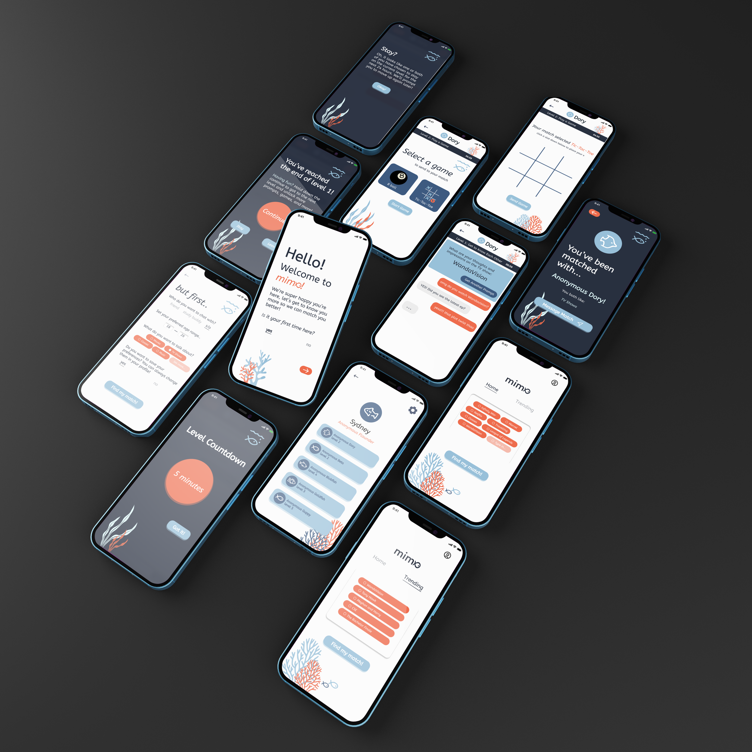
09. Hi-Fi Prototype
Creating the hi-fi prototype was the last step of our design process and was a culmination of all of our previous artifacts.
We were intentional in the color scheme, icons, visuals, and overall layout of the app that would be best in serving our user group.
Experience mimo.
Interact with the hi-fi prototype here.

Reflection
From team mimo.
For future iterations of our prototype, we hope to conduct more usability testing. Since this was a short 10-week project, we were only able to conduct four usability tests. While this was sufficient to move forward with our low fidelity design, we’d like to see more users interact with the prototype to learn what could be improved.
Another aspect is adding more levels to our app. Currently, we have two levels designed in our user interface, but we would like to add three more levels to provide a complete experience for the user. The concept and branding of our product are what we feel we did best and will continue to keep this consistent in future iterations. We are open to suggestions and feedback to continue to improve on our product.
From me.
This was my first UX Design project where I got to go through the entire human-centered design process. Through this process, I learned that I enjoy interviewing during the research phase. Getting to understand the users by speaking directly to them and having the chance to ideate solutions with them makes the designing process feel more meaningful. As a team member, I recognized that documentation throughout the design process is one of my strengths and something I’m excited to do for the team. Over the course of the 10 weeks, I created the document templates we used for our weekly deliverable reports. I like to be organized, and if I can create easy-to-fill-out templates that make documentation for each member easier, that’s great! Our team completed this entire project remotely, and while being remote had its challenges, I’m proud of my team for being able to work effectively together. 🫶
MORE SELECTED WORKS: INSTRUMENTAL | SIRI USABILITY TESTING STUDY | THE VERA PROJECT BRANDING


