Instrumental
Making Surgical Education More Accessible and Interactive
…
Sponsored by Surgical Science, my team at the University of Washington designed Instrumental, a software for surgeons to create interactive surgical training modules.
Check out the design process below. ↓
January 2022 - June 2022
18 Weeks
Annie Liu, Camryn Rogers,
Cameron Fahsholtz, Lyle Hamm
UX Designer, Survey Lead,
Documentation Lead
UX Research, UX Design,
Prototyping, Usability Testing,
Video Editing
Figma, Adobe Premiere Pro, Google Forms
Date
Duration
Team
Role
Skills
Tools

WHAT PROBLEM ARE WE TRYING TO SOLVE?
Our future surgeons want a more accessible learning method to become proficient in surgical skills.
Currently, the best learning method is to observe expert surgeries, but this has limitations in expert explanation during surgery, scheduling availability, and cost and time to travel.
WHY IS THIS PROBLEM IMPORTANT?
We want to protect patients.
By making surgical training accessible from anywhere, anytime, future surgeons will have more opportunity to practice key surgical skills — becoming more capable and confident. Gain proficiency in a procedure before even touching a patient.
SOOO, WHAT DID WE DO?
We designed Instrumental — a software where surgeons and educators can upload surgical video to create interactive training modules.
Modules are made to be accessible anywhere, anytime, directly from your personal computer.

See The Process
|
Research → Ideate → Prototype
|
See The Process | Research → Ideate → Prototype |
01. Research
Getting to know our users through interview and survey studies.
This project began with the goal of improving upon Surgical Science’s MaestroAR. Working through training modules created from recorded surgical procedures, users interact with augmented video on robotic surgery simulators to gain procedural familiarity and develop decision-making skills. The original project was to design a software to help robotic surgeons create MaestroAR modules.
Key Research Questions
Our initial user group consisted of surgeons practicing robotic surgery. Our team entered the research phase with the intention of understanding the following key research questions:
How do surgeons organize content when designing a MaestroAR module?
How long are surgeons willing to spend on editing a MaestroAR module?
How closely are surgeons involved in the creation of a MaestroAR module?
How did surgeons decide the assessment format for the interactive portions of their MaestroAR module?
What module editing tools are important to include within surgical AR training software?
How will surgeons learn to use the MaestroAR software?
Research Methods
To answer the key research questions, we used two methods: an interview study and a survey study. The findings of both these studies informed the project’s design requirements.

My Role
During the research phase, I was the Survey Study Lead. I created a plan for the survey, designed the questions, launched the survey (contacting over 800+ surgeons across the U.S.A. and posting on relevant subreddits), and collaborated with our Research Analysis Lead for survey response analysis. I interviewed one surgeon during the Interview Study.
Interview Study
Our team interviewed four surgeons.
The goal was to learn about the surgeons’ experiences with video editing software and VR surgical training technologies. We also presented a software idea, got their feedback, and asked how it might best fit the surgeon’s vision, needs, and potentially how they may use the software.
Interview Method & Analysis
Employed a semi-structured interview method.
Interviews lasted between 30-45 minutes.
With the participant’s consent, interviews were recorded and analyzed after each session.
Interview transcripts were coded and affinity mapped on Miro.

Interview Key Insights
Surgeons have limited time to create modules.
Surgeons are not tech savvy; use simple tools.
Identifying anatomy is one of the most important skills to learn.
Giving surgeons the procedural steps is good, but they also need the flexibility to make their own steps and rearrange.
Access to software and training modules should be portable.
Surgeons will spend no more than two hours on module editing and delegate these modules to technology teams available to them in their institutions.
Survey Study
We analyzed 22 survey responses.
Our survey helped us reach a greater audience in comparison to the interview study and helped reaffirm the findings from the interviews. There were three main parts of our survey: getting to know the user, introducing the software idea & gauging expectations, and understanding how users would use the software.
👩🏻💻 Survey Tool
Google Forms
👩🏻⚕️ Distribution
Forwarding the survey link to interview participants, posting the survey link on relevant subreddits, and emailing the survey link to surgeons.
🔍 Analysis
Survey data was imported into a Google Sheet and Miro for analysis. Any short or long answer responses were affinity mapped to discover themes in the data.
Affinity Mapping

Survey Key Insights
41% of surgeons had no prior experience with video editing software, and those who did were versed primarily in iMovie and Adobe Premiere Pro.
91% of surgeons responded that they would recruit help from surgical residents, attending surgeons, and fellows in the module creation process.
82% of surgeons were interested in the product proposal and felt that it was something they would use.
Surgeons felt that planning the module, cutting down the original video, and identifying and selecting body anatomy were the most necessary module creation steps for them to partake in.
Design Requirements
The creation of a module must be time efficient.
DR1.
The modules must be easy to pass off from a surgeon to a colleague for completion.
DR2.
Procedural steps must be foundational in the module learning experience.
DR3.

THE IDEA
Let’s design a Surgical Science software where surgeons can upload surgical footage and create their own interactive training modules.
02. Ideation
Answering design requirements and making user flows.
During the ideation phase, our team sought out to answer the design requirements with meaningful solutions. We began by creating user flows to understand the levels of complexity of moving through the software as a user.

My Role
I was the Ideation Lead. I oversaw the development of our project’s idea until the final deliverable. I ensured that our design solutions were in line with the set design requirements.
User Flows
Mapping out the user’s module creation experience.
Knowing that surgeons consider themselves less tech-savvy according to our research findings, our team stressed simplicity and time-efficiency when developing the user experience.
The following user flows were created during the user flow process, however, note that the current flows of our prototype are different since the user experience evolved over the course of the design process.
Considering Design Reqs.
To highlight how the design requirements impacted our design thinking, see our approaches and what was implemented in the design.
-
To eliminate complexity and save time, we made the module creation experience linear. Users are guided step-by-step with tutorials. As a result, the experience of creating a training module feels less daunting and more like you’re inputting information to build a module.
To make the UI more intuitive, our video-editing layout feels similar to that of popular video-editing platforms such as iMovie and Adobe Premiere Rush.
Automation is a useful tool to speed up the module creation process. When storyboarding, users can choose to edit an auto-filled storyboard versus creating one from scratch. Body anatomy identification assessments are generated for the user after receiving the necessary input. Closed captions are automatically generated for the user.
-
The software is intended to be cloud-based for easy access by multiple collaborators. There will be a log-in system for users to verify their identity and permissions to work on a training module. When passing off work from one collaborator to another, the next collaborator will be able to pick up from where the last one left off. It’s in our plans to implement a comment system for collaborators to communicate with each other.
-
This design requirement has set the foundation for the creation of all training modules. Training modules are split up into their procedural steps and tasks during the storyboarding phase of module creation. All other module creation phases, such as assigning video to tasks, creating assessments, and recording voice overs, depend on this structure, because users will build the modules task-by-task.

Building Instrumental.
03. Prototype
Developing the user interface and improving upon user experience.
Our team created a user interface for the software. We began with whiteboarding, before moving onto creating a low fidelity prototype in Figma, and then finally producing a high fidelity prototype. Throughout this entire process, we continuously received feedback from our sponsors and from each other as teammates.

My Role
During the prototyping phase, I continued my role as Ideation Lead along with my new roles as Lo-Fi Prototype Lead, Visual Design Lead, and Video Editor. In these roles, I pushed forward the development of our lo-fi prototype and moving into the hi-fi prototyping stage, I ensured that our visual system met Surgical Science’s Graphic Guidelines. The entirety of our presentation video was edited by myself, with the help of Lyle Hamm’s voiceovers.
Whiteboarding
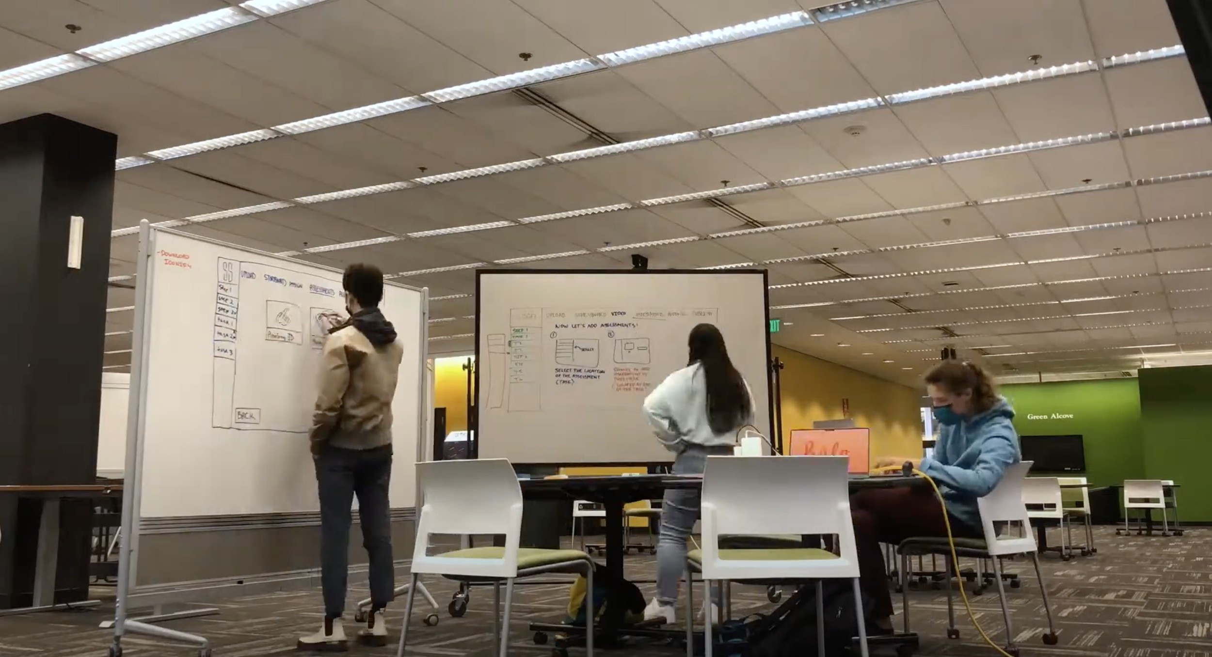
We sketched frames of our prototype on whiteboards to discuss how our user flows match the interface we envisioned. Sketching these frames before building them in Figma also gave us the opportunity to reassess the interactions we had designed while developing our user flows and make improvements.
Early stage whiteboarding.
Lo-Fi Prototype
Creating a basic level of visual cohesion and user experience.
While I helped design all screens in the prototype, I was solely in charge of the Multiple Choice and Select All That Apply assessment screens and Audio & Exporting screens. The interactive lo-fi prototype consisted over 60 frames. Below, I showcase the most key frames that illustrate the overall experience.

Collecting Feedback. Redesigning. Implementing the Visual System.
Redesigns, additional tools, and feedback from sponsors were implemented in the hi-fi prototype phase. The team aligned our visual design system with Surgical Science’s Graphic Guidelines.
Content Warning
Our high fidelity prototype contains graphic imagery from real surgical footage.
INTRODUCING
Instrumental.
Instrumental
Let’s walk through the main steps of creating a training module.
#1. New Module Project
To create a new module, the user can click the first grey box with the plus icon located in the “In-Progress Modules” section.
#2. Uploading Video
Users can drag and drop a video file into the frame, or they can click the “Upload” button to open their local computer files.
#3. Preliminary Details
The user is then prompted to fill in details of the procedure such as the title, description, video tags, and collaborators, as well as confirming they have permission to use the video they have uploaded.
#4. Storyboarding: Instruction
Instrumental utilizes storyboarding to plan out the instructional content of the training module. The training module is created from the procedure video, which is then organized into the procedure’s steps and tasks. Steps can be thought of as folders for tasks.
#4. Storyboarding: Choosing a Template
The user will then begin the storyboard process by selecting either an auto-filled template with suggested steps or they can choose to manually input.
#4. Storyboarding:
Adding Steps & Tasks
Here is an example of a screen the user will be on if they select an auto-filled template. They are given suggested steps for a radical prostatectomy and can rearrange, edit, delete, or add steps. Following this, the user can add tasks to each of the steps they previously created.
#5. Assigning Video
The user will then assign video to each task in the storyboard by dragging the blue bars to the beginning and end of the corresponding video clips.
Users can use the scissor tool to make cuts and select the video clips they want to delete. This tool becomes available once the beginning and end of a task clip have been assigned.
#6. Creating Assessments
Users can choose between Multiple Choice, Select All That Apply, and Anatomy Identification question types.
To add an assessment, the user first selects a task on the storyboard, then identifies which frame the assessment will appear at, and then they choose the type of assessment and create the assessment.
#7. Adding Voice Overs
The user can record narration as the video is playing so they can view where their narration lines up. If the user hits an assessment as they are recording, the recording will stop, and the playhead will snap to the first frame after the assessment. Adding frozen frames to the timeline allows the user to give more instruction at a specified frame.
#8. Verifying Module Transcript & CC
After the user is done recording their audio, the closed captions will then begin processing.
After processing is complete, the user will be able to see the captions for the entire module. The user can then scroll through the entire transcript and make edits as needed.
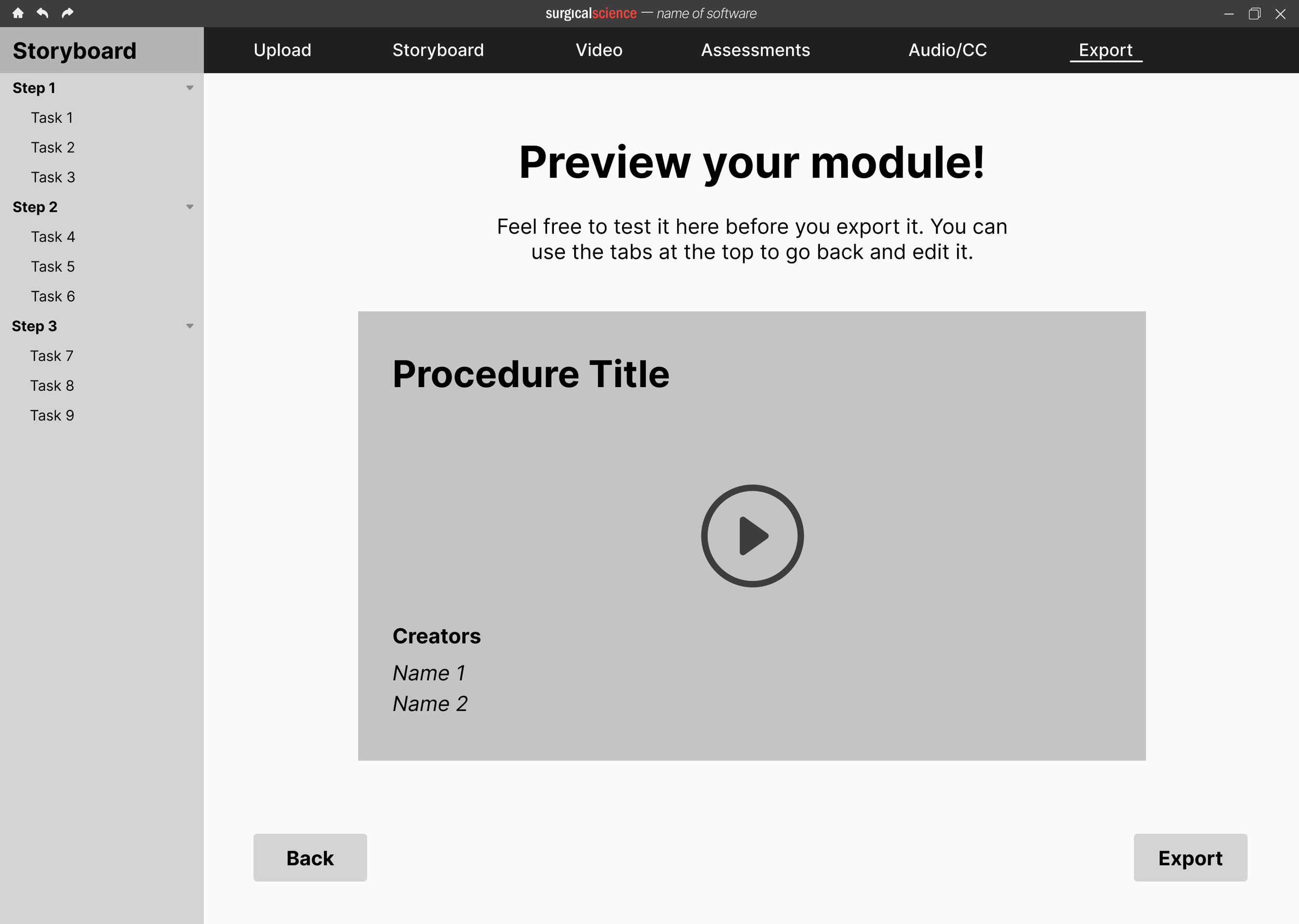
#9. Finalizing & Exporting
The user is shown the details and a preview of their module to confirm everything is correct. They confirm their permission to use the content in the module, that they claim responsibility for the educational content within the module, and that the content is medically accurate. The user will then click “Export” to complete the process.
Interact with Instrumental

OUT OF 22 UNDERGRADUATE CAPSTONE PROJECTS
Instrumental was awarded “Best-In-Show” at the 2022 Human Centered Design and Engineering Capstone Showcase. 🥇
Projects were judged by 15+ industry professionals in UX and faculty from the University of Washington’s Human Centered Design and Engineering department.
NEXT STEPS
Our sponsors took Instrumental to Product Development at Surgical Science.
Our sponsors at Surgical Science were elated with the outcome of this project and decided to move forward with this project by presenting it to research and product teams within the company for further development.
Reflection
Try something new! Your skills are more transferable than you may think.
I didn’t know anything about surgical education when this project began. What I found was that the willingness to continuously learn and the courage to step outside of your comfort zone are the two tools you need to immerse yourself in a new field. I had fun learning about something I used to be so unfamiliar with, and getting to work with a unique user group was a valuable experience.
I feel lucky that my project was to create something that would help others create. As an artist, designer, and maker, I believe that the ability to create is empowering and that everyone should have the opportunity to realize their creative potentials. We just need the right tools. I’m glad that I was able to bring my prior video-editing experience into this project, and that I was able to edit our final video for us! This project experience showed me that my skill set is more applicable and valuable than I had originally thought.
Your team is everything.
I feel like I couldn’t have had a better team. We supported each other. Everyone cared and wanted to see this project be a success. We always kept our users in mind throughout the entire process, and we were incredibly productive! One thing we always did was have an action plan for what we wanted to accomplish during meetings together and what we each needed to individually accomplish before the next time we met. I’m excited to bring this same energy to my next team dynamic.
…
I’m incredibly proud of what my team accomplished with this project. We truly couldn’t have done it without the support of our sponsors at Surgical Science, the input of all the surgeons we talked to and received feedback from, and the HCDE 492/493 teaching team. Thank you. ⭐

Behind the Scenes

It’s all in the details.
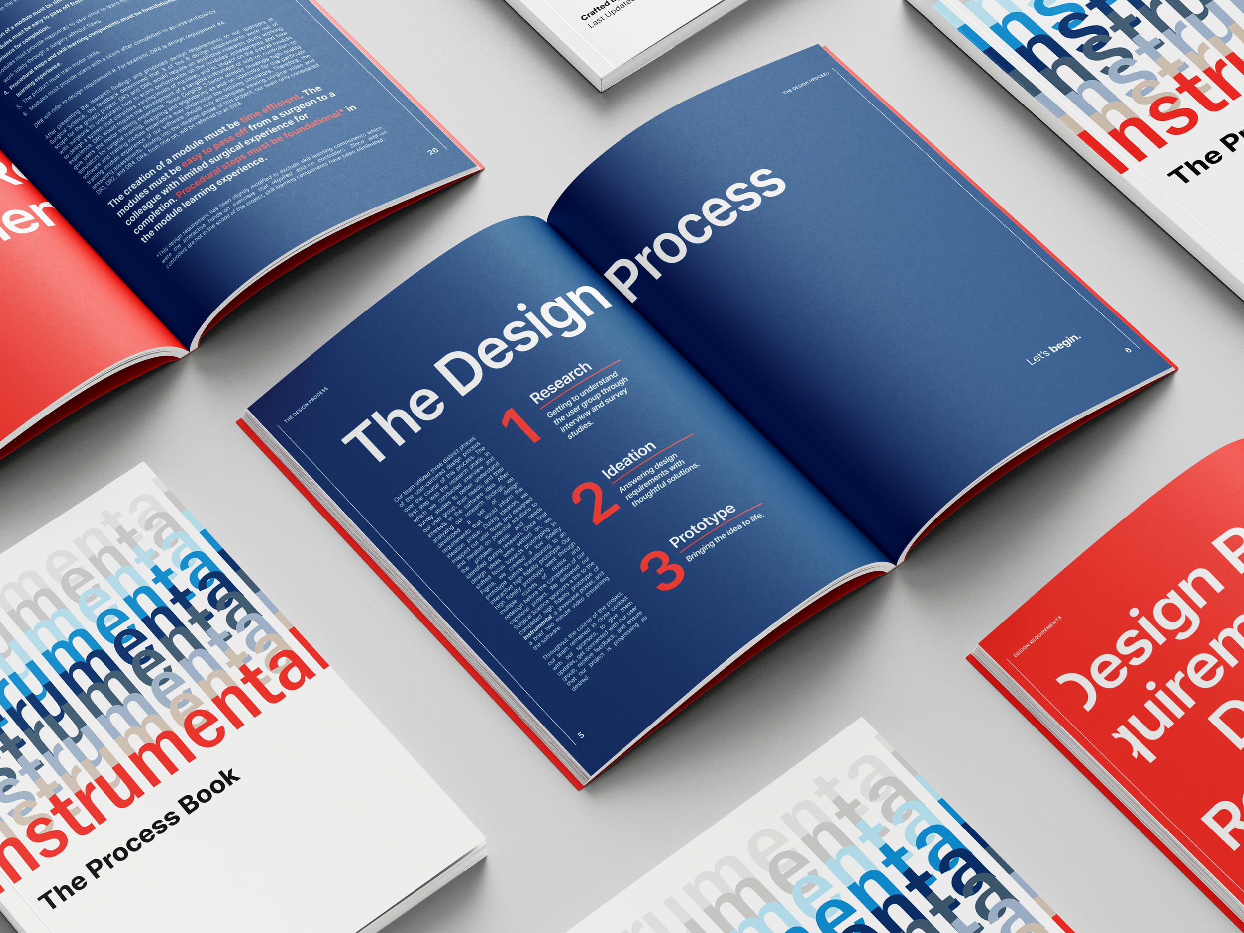
This page offered a summarized presentation of the Instrumental design process. To learn more, check out the Instrumental Process Book.
MORE SELECTED WORKS: MIMO | SIRI USABILITY TESTING STUDY | THE VERA PROJECT BRANDING


